Tutorial
Livewire autocomplete is a component that allows you to display a list of results, that can be filtered using the value entered into the input. It also enables a new record to be created with the value from the input.
First let's look at how we can use the autocomplete component to display search results.
Prerequisites
This tutorial assumes we already have a new Laravel app set up and we have installed Livewire and installed Tailwind for Laravel. See their relevant docs for instructions.
You should also install this package as per the [[installation]] instructions and add it to your Tailwind config.
Creating a Livewire component
Next we are going to need a Livewire component. So let's create a UsersList component to display all of the users in our app by running:
php artisan livewire:make UsersListOnce the component has created, bind it to a route so it is ready to use:
// routes/web.phpuse App\Livewire\UsersList;use Illuminate\Support\Facades\Route; Route::get('/users', UsersList::class);Seeding some users
The last step before we get to adding the autocomplete component to our UsersList view is we need a list of users to display in our component.
To do this, we can uncomment the user's factory call in our database/seeders/DatabaseSeeder.php and let's also change it to generate 200 users:
class DatabaseSeeder extends Seeder{ /** * Seed the application's database. */ public function run(): void { User::factory(200)->create(); User::factory()->create([ 'name' => 'Test User', 'email' => 'test@example.com', ]); }}Now we can migrate and seed our users to the database by running:
php artisan migrate --seedCreate the database if you get prompted too.
We should now have a database with a bunch of users seeded, ready for us to search through.
Adding users computed property
For us to display a list of the users in our autocomplete component, we need to make them available in our Livewire component.
Our preferred way to do this is to use computed properties.
So let's add a users computed property to our UsersList Livewire component.
Open app/Livewire/UsersList.php and above our render method, lets add the users computed property and we will return from it all users from the database, sorted by name.
use App\Models\User;use Livewire\Attributes\Computed;use Livewire\Component; class UsersList extends Component{ #[Computed] public function users() { return User::orderBy('name')->get(); } public function render() { return view('livewire.users-list'); }}The x-autocomplete component
Next we can start adding our autocomplete component to the view. If we open up resources/views/livewire/users-list.blade.php, let's remove the auto-generated comment but leave the <div>.
Inside the <div> we are going to add the wrapping autocomplete component <x-autocomplete>:
<div> <x-autocomplete> </x-autocomplete></div>For now, that is all we are going to do with the main autcomplete component, but we will come back to it shortly.
We should also add some classes to our <div> to ensure that our autocomplete looks right and doesn't take up the whole page. To do this, add class="p-4 max-w-80 mx-auto":
<div class="p-4 max-w-80 mx-auto"> <x-autocomplete> </x-autocomplete></div>The x-autocomplete.input component
Next we need to add the input component. This is where users will type to search to filter down the results and it also how the autocomplete dropdown is triggered.
Inside our <x-autocomplete> component, we will add <x-autocomplete.input>:
<x-autocomplete> <x-autocomplete.input /></x-autocomplete>Now if we go to our browser and refresh the page, we should see our input.
If the styles don't look right, then make sure you have configured Tailwind correctly and are building your assets using npm run dev
The x-autocomplete.list component
If we click in the input in our browser, we will see that currently nothing happens. So our next step is to add our list component where we will display the users.
Let's add the <x-autocomplete.list> component below our <x-autocomplete.input> component.
<x-autocomplete> <x-autocomplete.input /> <x-autocomplete.list> </x-autocomplete.list></x-autocomplete>Now if we refresh our browser and click on the input, we should see an empty box appear.
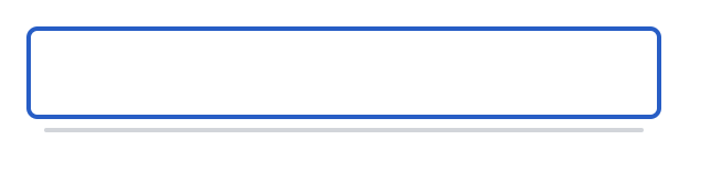
It's hard to see but that line below the input is the list component, but as there is no contents, it is being displayed as a line.
So let's add something to it.
The x-autocomplete.item component
Now we can actually display our users inside our list component. To do this, we are going to use the iterate through the users from the users computed property and display a <x-autocomplete.item> component for each one.
So let's add the following inside our <x-autocomplete.list>:
<x-autocomplete> <x-autocomplete.input /> <x-autocomplete.list> @foreach ($this->users as $user) <x-autocomplete.item> {{ $user->name }} </x-autocomplete.item> @endforeach </x-autocomplete.list></x-autocomplete>To access computed properties in Livewire, we need to ensure we use $this-> to access it, like $this->users
Above, we iterate through each of the users and display an <x-autocomplete.item> and we also echo out the users name into the slot of the item component.
You can output anything into this slot, incase you want extra data, icons, or anything else you desire.
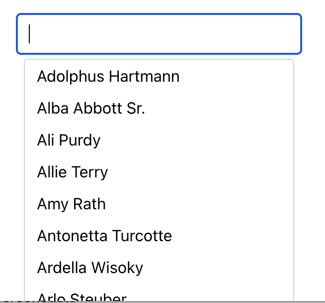
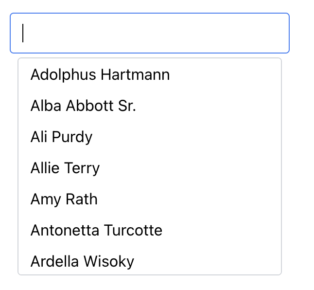
If we refresh our browser now and click on the input, we should see our list appear with all of our 200 users.
Adding styles to limit the list height
Now we don't actually want our list to be displaying all our records down the screen list this. Instead we would want to limit how high the list is and instead allow the list to scroll.
To do this, we just add some Tailwind classes to the <x-autocomplete.list> component like you would any other HTML element.
So lets add class="max-h-56" to our <x-autocomplete.list> component:
<x-autocomplete.list class="max-h-56"> ...</x-autocomplete.list>If we refresh our browser now, we can see the list height is constrained at the list can now be scrolled.

The x-autocomplete.list component already has overflow-auto class on it, hence why it automatically scrolls. See [[#x-autocomplete.list]] for full details on what classes are applied by default.
Keying the x-autocomplete.item
By default, the autocomplete component doesn't know how to distinguish one item from the next. Due to this we need to add a key attribute to the <x-autocomplete.item> components.
A good key is something that is unique to the row, such as the users ID. As <x-autocomplete.item> is a blade component, it means we can use blade short attribute syntax to pass the users ID into the component. So let's pass the user ID in as a key:
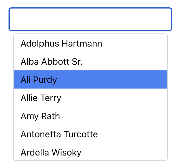
@foreach ($this->users as $user) <x-autocomplete.item :key="$user->id" > {{ $user->name }} </x-autocomplete.item>@endforeachLet's go back to our browser, refresh and click on the input, we can see our users. If we now arrow down, we can see the first result gets highlighted. We can keep arrowing down or up to highlight the next/previous result.
There are bunch of other keyboard shortcuts. See [[#keyboard-shortcuts]] for the full list.
Hovering the mouse over results will also highlight that result.
But if you hit enter while a result is highlight or clicking on a result, you will notice that nothing happens. That is our next step.
Adding value to the x-autocomplete.item
When selecting a result, either by keyboard navigation or using the mouse, the autocomplete component will update the input with the selected result. But as our x-autocomplete.item component slot that takes html/blade, we instead need to instruct the autocomplete component what it should display in the input when a selection is made.
To do this, we can add the value attribute to the x-autocomplete.item component. In our example, we want to display the users name in the input on selection, so let's add:
@foreach ($this->users as $user) <x-autocomplete.item :key="$user->id" :value="$user->name" > {{ $user->name }} </x-autocomplete.item>@endforeachAgain we have used blade short attribute syntax to pass the user's name in as the value.
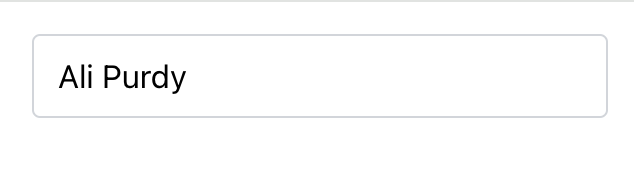
If we refresh the browser and select a record, we can now see the input value has changed.
Filtering the list based on user input
If we refresh the page again and display the list of users, when we type something in the input, nothing happens. This is because we haven't yet wired up the input using Livewire.
For this, we are going to need a public property which the input will be wired to. The name of the property can be anything that suits your needs or app. You could call it search, name, userName or something like that.
Let's call ours search to keep it simple. First let's add a $search public property in our UsersList class and set it to an empty string by default.
class UsersList extends Component{ public $search = ''; ...}We also need to update our users computed property to filter the users returned based on the search value.
So let's update it to include a when() clause.
class UsersList extends Component{ ... #[Computed] public function users() { return User::orderBy('name') ->when( $this->search, fn ($query, $value) => $query->where('name', 'like', "%{$value}%") ) ->get(); } ...}This ensures that if the $search property has a value, then we look for any of the user's with the name that contains the search value.
The final step is to wire up our input to the $search property.
Back in our view, we need to add wire:model.live="search" attribute to our x-autocomplete.input component.
<x-autocomplete.input wire:model.live="search" />We need to use .live here as we want Livewire to send requests as users type.
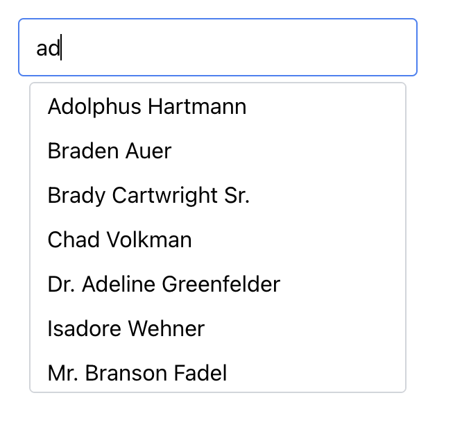
If we refresh our browser and type something in, we can now see our results filtered.
But if we try to hit backspace/delete, the page errors.
This is because the autocomplete is trying to clear out any selected result, but we haven't yet wired up the autocomplete component to Livewire with the selected result.
Wiring up the selected result
Once of the goals of an autocomplete component is to allow you to search through a list of existing results and select one of them.
At this stage we haven't wired up the selected result to Livewire. So let's do that now.
To do this, we are going to need another public property on our component. I like to name this based on the data that is going to be in the property. For our example this will be the users ID, so we will name the property $userId.
In our UsersList class, let's add a $userId public property and set it to null by default.
class UsersList extends Component{ public $search = ''; public $userId = null; ...}Now in our view, we need to connect the autocomplete component to this property. To do this, we need to add wire:model.live="userId" to our x-autocomplete wrapping component.
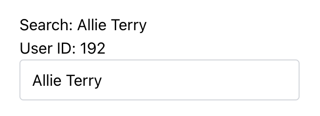
<x-autocomplete wire:model.live="userId"> ...</x-autocomplete>Let's also echo out the $search and $userId properties into the view, so we can confirm everything is working propertly.
Above our x-autocomplete component, but inside the <div>, lets echo out these properties.
<div class="p-4 max-w-80 mx-auto"> <p>Search: {{ $search }}</p> <p>User ID: {{ $userId }}</p> <x-autocomplete wire:model.live="userId"> ... </x-autocomplete></div>If we go back to the browser now, we should see these.
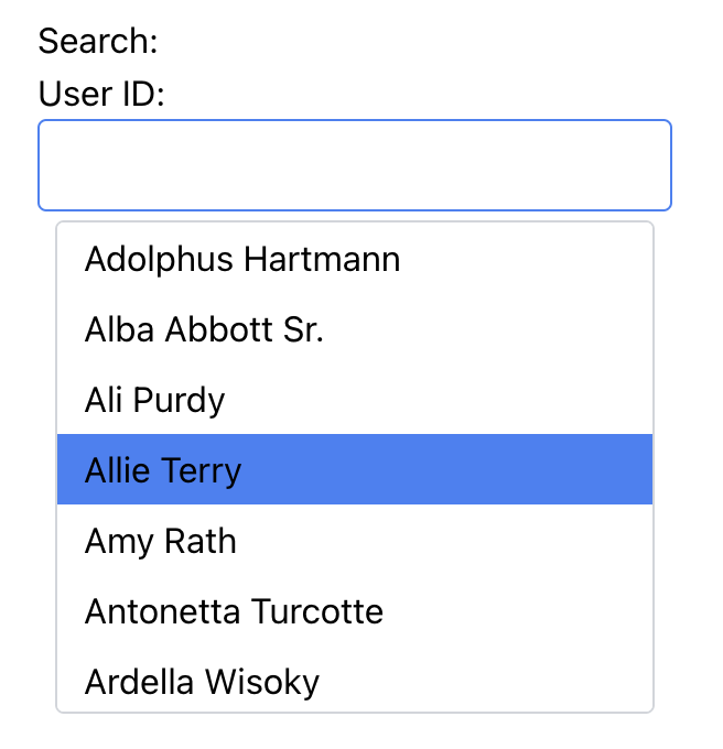
And if we select a result, we can see the $search and the $userId properties update.
Success!
Success! We have successfully got our autocomplete component working, allowing us to display a list of users, filter those users, and select a specific user.
From here you can use the $userId property in a save() method or something like that to persist the selected user.